The map that shows you how prosperity is changing

Is GDP the best way to measure prosperity? Image: REUTERS/Brian Snyder
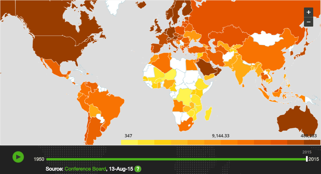
A new interactive map highlights the huge global differences in wealth that still remain, despite the progress made in tackling poverty.
By looking at GDP per person from 1950 to 2015, the map shows both the changes in personal and household wealth at a national level, but also around the world (click on the screenshot below to access the full interactive version).

Source: humanprogress.org
The good news
The data highlights the overall increase in prosperity since 1950.
Sixty six years ago, global average GDP stood at a little over $14,500 per person. By 2015, this had risen to nearly $25,600.
Asia has made noticeable progress, with China, Japan and South Korea all seeing increases. Latin America has also seen improvements.
This is all part of a broader trend of global poverty reduction. In 2015, the percentage of the world population living in extreme poverty fell beneath 10% for the first time.

The not-so-good news
The map emphasises the extent of global inequality, with the huge differences between regions and countries failing to narrow.
And Africa, in particular, continues to lag behind much of the world. Although some data is missing, much lower levels of per capita GDP exist across the continent.

Source: humanprogress.org
As this chart of the data used in the map shows, average GDP per person in Africa is now over $20,000 less than the global average.
However, the suitability of GDP to measure progress and prosperity is a matter of some debate.
Is there a problem with GDP?
At the World Economic Forum’s Annual Meeting 2016, leaders discussed whether GDP was an adequate measure for well-being and the health of economies.
Three leading economists and academics all agreed that we need a new way to measure growth. As MIT professor Erik Brynjolfsson argued, the man behind the concept, Simon Kuznets “understood that GDP is not a welfare measure, it is not a measure of how well we are all doing. It counts the things that we’re buying and selling, but it’s quite possible for GDP to go in the opposite direction of welfare.”
This is important context when viewing the map. However, it shouldn’t detract from the global picture that emerges – both the progress made and the challenges that remain.
Don't miss any update on this topic
Create a free account and access your personalized content collection with our latest publications and analyses.
License and Republishing
World Economic Forum articles may be republished in accordance with the Creative Commons Attribution-NonCommercial-NoDerivatives 4.0 International Public License, and in accordance with our Terms of Use.
The views expressed in this article are those of the author alone and not the World Economic Forum.
Stay up to date:
Economic Progress
Forum Stories newsletter
Bringing you weekly curated insights and analysis on the global issues that matter.
More on Economic GrowthSee all
Council on the Future of Growth and 2023-2024
December 20, 2024


