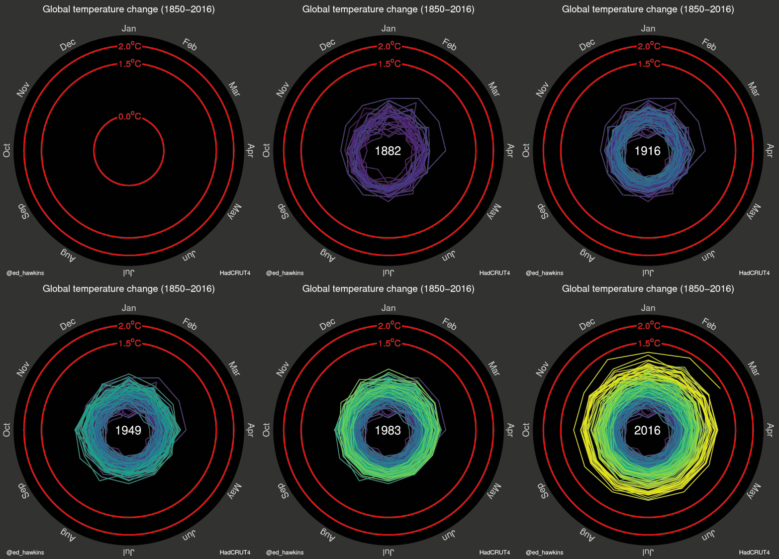
This animation shows how the Earth has warmed up since 1850

2015 and the first half of 2016 are shown to be significantly warmer than proceeding years.
Image: REUTERS/NASA/Michael Studinger
Stay up to date:
Global Risks
It is difficult to really visualize global warming, but a new animation vividly illustrates how much global temperatures have risen since 1850.
Constructed using data from the UK’s Met Office, the animation shows global warming rapidly gathering pace in recent years.
What’s different about it?
Ed Hawkins, a climate scientist at the University of Reading, developed the unique animation to show the average monthly temperatures as a spiral shape, getting larger as the world has got warmer.

What is 2016 looking like so far?
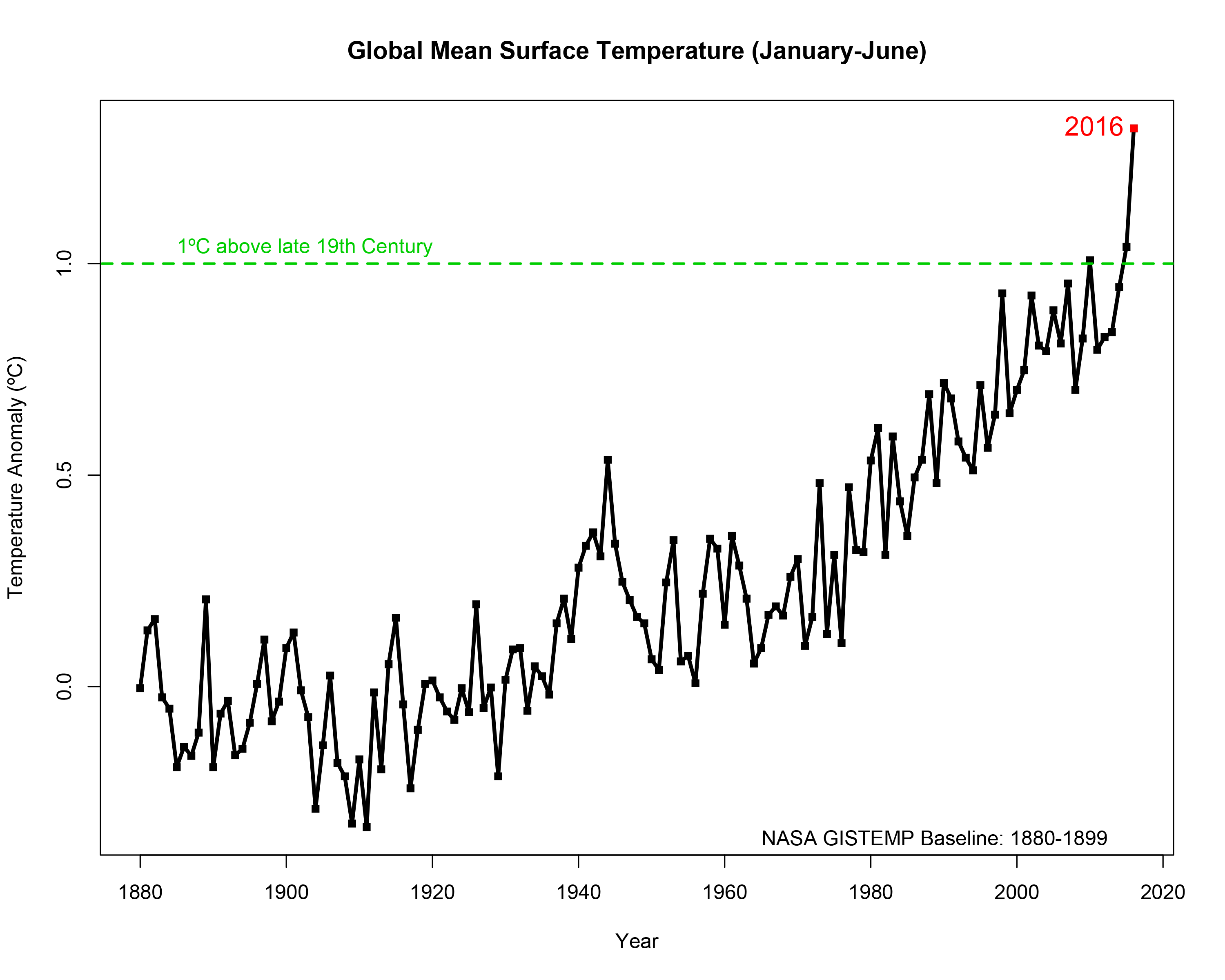
Both 2015 and the first six months of 2016 are shown to be significantly warmer than the proceeding years. If you look at the data used in the spiral animation and in the graph below from NASA, it is clear how much 2016 stands out.

Last month was the hottest June ever recorded globally, and the 14th consecutive month of record-breaking heat, according to data from NASA and the National Oceanic and Atmospheric Administration (NOAA).
June 2016 was 0.9C hotter than the average for the 20th century, and the hottest June since records began. NASA’s figures compare each month going back to 1880 against average temperatures between 1951 and 1980.
Accept our marketing cookies to access this content.
These cookies are currently disabled in your browser.
What's happening to sea ice?
Sea ice has been shrinking faster than normal with five out of the first six months of 2016 seeing the smallest respective monthly Arctic sea ice extent since satellite records started in 1979.
The extent of Arctic sea ice at the peak of the summer melt season now typically covers 40 percent less area than it did in the late 1970s and early 1980s.
"It has been a record year so far for global temperatures, but the record high temperatures in the Arctic over the past six months have been even more extreme," Walt Meier, a NASA Goddard sea ice scientist, said in a statement.
"This warmth as well as unusual weather patterns have led to the record low sea ice extents so far this year."
While El Niño has been a significant factor in recent temperature increases, it is by no means the whole story. Most of the current warming, compared to pre-Industrial Revolution levels, is the direct result of greenhouse gas emissions.
With temperatures this year at times getting so close to 1.5 degrees Celsius above pre-industrial levels, the key threshold of 2 degrees no longer seems remote or intangible.
Why is 2 degrees so significant?
The 2 degrees Celsius mark is held as a significant point for life on earth, and has traditionally featured strongly in climate discussions.
Climate researchers believe that an increase in global average temperatures of 2 degrees Celsius above pre-industrial levels would take the world into unchartered territory, with potentially unforeseen consequences in terms of extreme weather and climate feedbacks that could accelerate the melting of polar ice and sea-level rise.
The Paris Agreement, drafted last December, aims to limit warming to less than 2 degrees above pre-industrial levels, with a more ambitious target of 1.5 degrees.
As the animation shows, that temperature is very close to being reached for the first time.
Don't miss any update on this topic
Create a free account and access your personalized content collection with our latest publications and analyses.
License and Republishing
World Economic Forum articles may be republished in accordance with the Creative Commons Attribution-NonCommercial-NoDerivatives 4.0 International Public License, and in accordance with our Terms of Use.
The views expressed in this article are those of the author alone and not the World Economic Forum.
Related topics:
Forum Stories newsletter
Bringing you weekly curated insights and analysis on the global issues that matter.
More on Climate ActionSee all
Sebastian Buckup and Beth Bovis
July 10, 2025
Majlinda Bregu
July 9, 2025
Tom Crowfoot
July 8, 2025
Duncan Wood
July 8, 2025
Sam Markey, Basmah AlBuhairan, Muhammad Al-Humayed and Anu Devi
July 8, 2025


