7 charts that show gender inequality around the world

What gets measured gets managed Image: REUTERS/Ahmed Jadallah
The late data wiz and edutainer Hans Rosling once said: “My interest is not data, it’s the world. And part of world development you can see in numbers. The idea is to go from numbers to information to understanding.”
Good data gives the world the information it needs to act upon pressing issues, and visualizations can help bring the data to life. Covering many areas of ongoing unfairness, from the gender pay gap to the unmet need for family planning, below are seven excellent examples of data visualizations that have increased awareness, demystified research, and illustrated the gravity of continuing gender-based discrimination across the globe.
The Wall Street Journal explores the pay gap between men and women in 422 US occupations.
Despite the fact that full income parity could add up to 26% to world GDP by 2025, women across the world are still vastly underpaid compared with their male counterparts. In the United States, the average woman will earn 78 cents for every dollar a man earns. Globally, that discrepancy is even worse, at only 50 cents to the dollar.
Did you know? At the current rate, closing the pay gap will take another 170 years
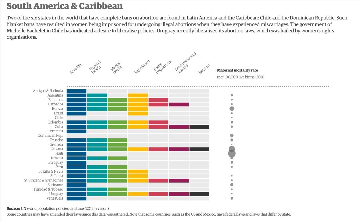
This interactive bar chart from The Guardian shows country-by-country breakdowns of abortion rights, including where the procedure is permitted and under which specific circumstances.
Almost all abortion-related deaths occur in developing countries, with the highest number concentrated in Africa. Recent studies estimate that 8–18% of maternal deaths worldwide are due to unsafe abortion, and the number of abortion-related deaths in 2014 ranged from 22,500 to 44,000.
Did you know? There are still six countries in the world that do not permit abortion under any circumstances.
Gapminder’s totally customizable display allows users to compare many data sets of their choosing – everything from life expectancy, to trends in childbearing, to average age of marriage and beyond – over time and broken down geographically.
The year-over-year display shows both the growth of gender parity in primary and secondary education as well as the increasing age of marriage over time. However, 121 million children and adolescents are currently out of primary and lower secondary school worldwide – a number that has remained essentially constant since 2007.
Did you know? Each year of secondary education reduces the likelihood of marrying before the age of 18 by at least five percentage points.
This interactive website from World Economic Forum visually lays out the gaps between women and men across four key areas – health, education, economics and politics – to determine which are the best and worst countries for gender parity.
Of all the data displayed, political representation (which includes female members of parliament, females at the ministerial level and female heads of state) has seen the least progress over time, with a median gender gap of only 16.5%. Rwanda tops the list with the most women in parliament.
Did you know? There is no nation in the world that has a gender parity score of 100%.
The bedrock of gender equality is a woman’s ability to control her own body and fertility. This data visualization from No Ceilings shows the change in modern contraception usage around the world from 1970 to 2015.
The trend towards contraceptive uptake over the years is encouraging, but this tool also illustrates gaps in family planning that still exist in many parts of the world. Satisfying the current unmet need for contraception in developing countries alone could help avert 67 million unintended pregnancies per year. It could also prevent the deaths of 76,000 women from pregnancy-related causes.
Did you know? Globally, 214 million women still can't get hold of modern contraception.
Women face huge obstacles when it comes to carving out time for themselves. As illustrated through this OECD display, the concept of work-life balance not only varies across cultures, there are gender components to this data that cannot be ignored.
Women do not stop working when they leave their offices. At home, they bear the brunt of unpaid work, such as cooking and cleaning, as well as caring for children, the sick and the elderly. The average Italian woman spends 22 hours (or almost 3 full-time workdays) more than her partner on unpaid work per week, while this gap averages 5 hours in the Nordic countries. Altogether, the estimated annual value of women’s unpaid work totals $10 trillion, or 13% of global GDP.
Did you know? If women and men were to share unpaid tasks equally, women would gain 5 hours of free time per week.
Providing nutritional support for all women and babies is a small price to pay for healthy future generations. Yet this data map from the World Policy Analysis Center shows a stark contrast in parental leave policies across countries.
The World Health Organization recommends at least 6 months of breastfeeding, which is challenging for working mothers without generous paid-leave policies. In family-friendly nations like Sweden, parents are given 480 paid days per child. Compare that to the US – where paid maternal leave is optional – and it is no surprise that only 14% of employers chose to extend such a benefit.
Did you know? The only countries that do not mandate paid maternity leave are Papua New Guinea, Suriname and the US.
What gets measured gets managed. For gender equality advocates, data visualizations like those above, motiongraphics like Nike’s popular Girl Effect, and infographics like the ones Women Deliver is known for help tell a richer story, thereby turning evidence into action for girls and women everywhere.
What all of these data visualizations demonstrate is that we still have far to go in the name of gender equality. But thanks to the combination of solid evidence and innovative design, the way forward is becoming clearer.
Don't miss any update on this topic
Create a free account and access your personalized content collection with our latest publications and analyses.
License and Republishing
World Economic Forum articles may be republished in accordance with the Creative Commons Attribution-NonCommercial-NoDerivatives 4.0 International Public License, and in accordance with our Terms of Use.
The views expressed in this article are those of the author alone and not the World Economic Forum.
Stay up to date:
Education
Related topics:
Forum Stories newsletter
Bringing you weekly curated insights and analysis on the global issues that matter.
More on Education and SkillsSee all
Jumoke Oduwole and Abir Ibrahim
November 11, 2025


